
A Designer’s Guide to a Monochromatic Color Palette
Explore how to create a simple and visually appealing monochrome color palette for your graphic designs.
Color is a universal language.
It can set the tone and affect how we react. But choosing multiple colors can be daunting. Perhaps the most effective method for your design is using only one color - monochromatic harmony! This article will provide tips and tricks for incorporating monochromatic magic into your designs.
What is a color palette?
Before we go into a monochromatic color palette, we must first understand what a color palette is. A color palette is the combination of colors chosen for your design needs, such as animation, websites, product packs and more. By combining different colors, we can create infinite color palettes - each combination evokes a different mood. One helpful tip in picking a color palette is using color theory. Color theory is essential when selecting a color palette because it helps to ensure that the colors you choose will work well together and create a cohesive overall design. By understanding the relationships between different colors, you can choose a harmonious and pleasing palette that could achieve the desired visual impact.
What is a monochromatic color palette?
Let’s first break down the word monochrome. According to its Greek roots, the word breaks down into two parts.
- Mono- “One”
- Chrome- “Color”
However, it's not as simple as it sounds. A monochromatic color palette takes it a step further by using one single hue as a basis, examining all the variations of that hue, and experimenting with how light or dark a color is, also known as the color's value. We use the terms hue, tint, tone, each of these terms has a very specific meaning behind it and is an important building block of a monochromatic color palette. So let us break it down:
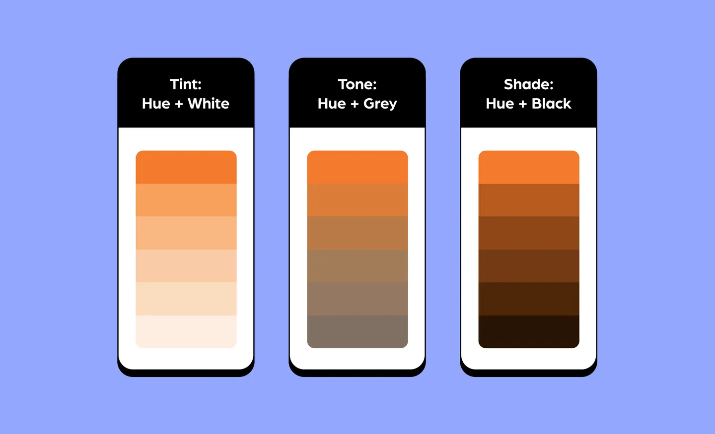
Shade
Shades combine black with a base hue to create a darker color. It makes the color more vivid and rich in quality.
Tone
Tones combine gray with the base hue to create a muted color. It appears deeper, but the overall brightness reduces, making it slightly dull.
Tint
Tints combine white with a base hue to lighten and soften the color. Tint can help balance the intensity of the color palettes.
Why use a monochromatic color palette?
There are several advantages of using monochromatic harmony.
- It creates a harmonious design, visually giving a classy, organized and cohesive look.
- It lets the content shine by not drawing too much attention to itself.
- It can help with brand awareness due to its association with a specific, unique color.
- It decreases the likelihood of choosing colors that may clash with one another.
5 tips on using a monochromatic color palette
Choose a base color that conveys the right message
The base color you choose will make the other variation of colors for your palette, so take your time and think about it carefully. The color you decide on must communicate the right message as it creates a response in your body, affecting emotions, cognitive and motor skills, as seen in color psychology.
Building a color palette
Monochromatic palettes often have three to seven variants in your color palette, consisting of lighter tints and darker hues of the original color.
It is always a good idea to experiment with different variations. Using digital tools like Iconscout ‘Color Editor’ or other palette generators comes in handy. Then, narrow down to a few you feel work best together.
Brand identity
Monochromatic designs are one of the ideal methods for achieving visual cohesiveness. Numerous factors develop a visual identity, but colors are crucial in distinguishing the brand.
Start by knowing your target audiences. If it's a personal project, choose your favorite color. But when it comes to brands, select a hue that resonates with the desired audiences and explains the brand’s corporate identity.
Bold palette by adding only white and blacks hues
It can be fun to play with vivid colors, but it could be a little too harsh. Incorporate light tints or deep shades to produce a statement without overly overpowering. It could also balance the brighter hue, acting as an accent color.
Muted palette by adding grey to a hue.
A muted monochromatic palette is commonly seen in lifestyle brands or used to give a more classy look to a design. It can provide a peaceful quality in the designs. Adjusting the hues with grey tones could give a sense of serenity or warmth.
Examples of monochromatic palettes on brand websites
Hedy
Clearly, the primary color of Hedy’s website is white, but it’s accented with touches of tint orange-peach color to make it an inviting training solution platform for their users

ID Néon
ID Néon, a Swiss company specializing in advertising, uses bold red colors to create a sense of excitement and showcase the significance of visual communication.

Alhamrani Universal
Bright blue color can give Alhamrani Universal users a instill feeling of confidence and professionalism in their fintech service, while the animation gives visual interest.

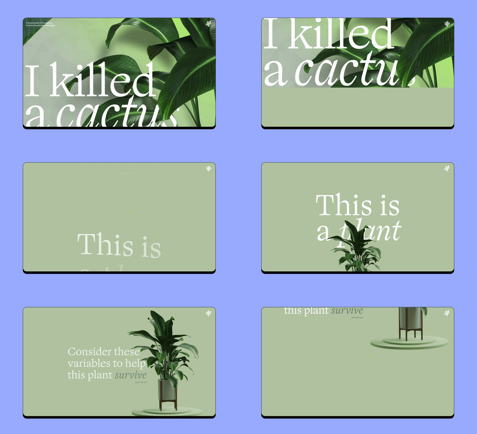
I Killed A Cactus
The website for I Killed A Cactus features a range of green shades for a natural feel, with white or dark shades of green text for high readability against the green background.
The Field by WSJ Custom Events
"The Field" VR Experience page displays electric kinetic typography in a space with floating particles. The color violet is used throughout the page in the lettering, buttons and menu.

Heresto
Heresto uses a minimalist design featuring bold use of yellow complemented by hints of black and white, with that rotates a bottle as the user scrolls through the site to avoid monotony.

How to use a monochromatic color palette on IconScout
Now that we know more about the monochromatic color palette let us help you edit icons, illustrations, or Lottie animation to fit the palette. We'll go over three options that you can choose from.
Edit colors with the Color Editor.
The Color Editor is a free lifesaving online tool for an easy and fast way to edit SVG colors. Here are just simple steps:
- Upload your SVG.

You get to search from over 5.5 million assets on our website and download them as an SVG file
- Edit the SVG.

Select the monochrome mode that can instantly apply custom colors to your icons and illustrations. You can also change saturation to give a bold or muted look.
- Download and add.

Enjoy your freshly edited design by downloading the icon in PNG or SVG Format and incorporating it into your plans.
Automatically edit the color of all your search results (for vector icons and illustrations).
Tweak the colors of all our vector icons and illustration library assets to match your design and aesthetics.
- Press the ‘Color Palette’ button and see the colors change.

Use preset color palettes provided by IconScout or create your custom palette

If you don’t have a color in mind, we got you covered with preset colors you can play around with and be inspired.
Now you are all set to customize your design with a monochromatic look! Use our ‘Color Editor’ to edit your icons and illustrations easily with just a few clicks.
Related Blogs
Access the world's largest Design Ecosystem: Assets, Integrations, and Motion.


