Design, often seen as an abstract concept, carries incredible power. It's more than just delving into these principles. It's the subtle art that silently steers our attention, shapes our perceptions, and molds our experiences.
Design principles are the guiding lights that add structure to this abstract art. They help us create visually pleasing layouts, establish harmony between elements, and craft meaningful experiences that resonate with the viewers. Tapping into these fundamental principles can elevate your designs, making them more impactful and engaging.
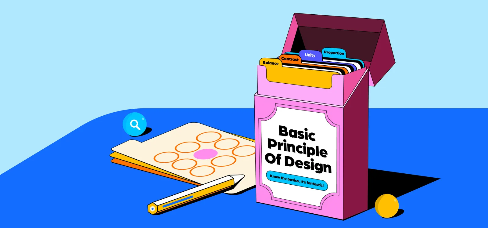
In this comprehensive guide, we will delve into the basic core principles of design, providing you with valuable insights to enhance your design skills and create visually stunning experiences.
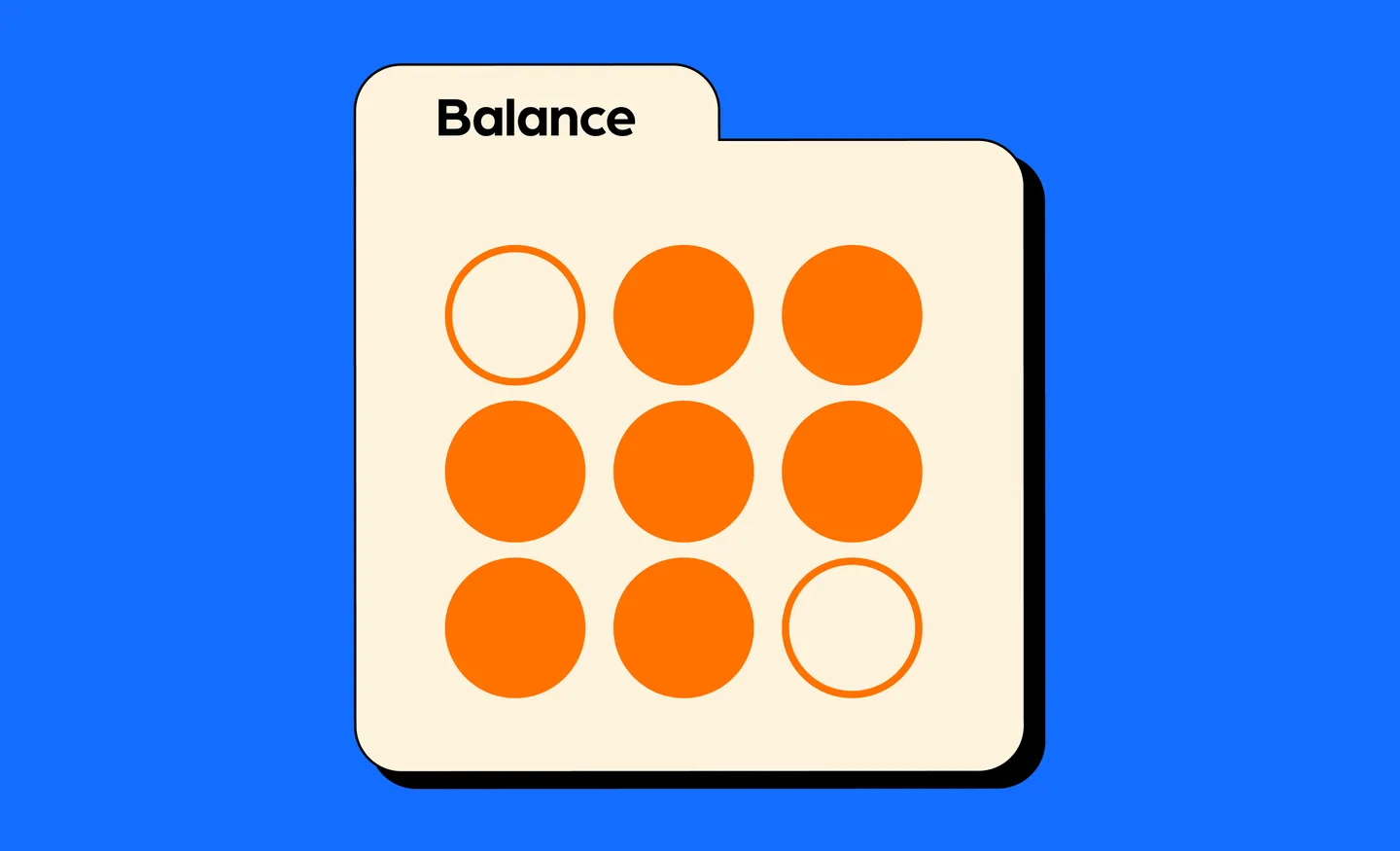
1. Balance: The dance of harmony
Picture yourself on a tightrope, carefully balancing your way to the other side. In design, balance refers to the distribution of visual weight within a composition. It's the secret ingredient that creates a sense of harmony and stability.
Balance is all about achieving visual equilibrium within a design. It ensures that elements are appropriately distributed to create a sense of harmony and stability.
There are two types of balance - symmetrical and asymmetrical balance.
Symmetrical balance: Imagine a mirror splitting your design into two identical halves. Symmetrical balance places elements equally on either side, evoking a sense of order and formality. Think of a balanced logo, like McDonald's golden arches or Chanel's interlocked "C's."
Asymmetrical balance: Unlike its symmetrical counterpart, asymmetrical balance achieves equilibrium through the careful arrangement of contrasting elements. It adds dynamism and visual interest to a design. Consider a magazine layout with a large image on one side and complementary text on the other.
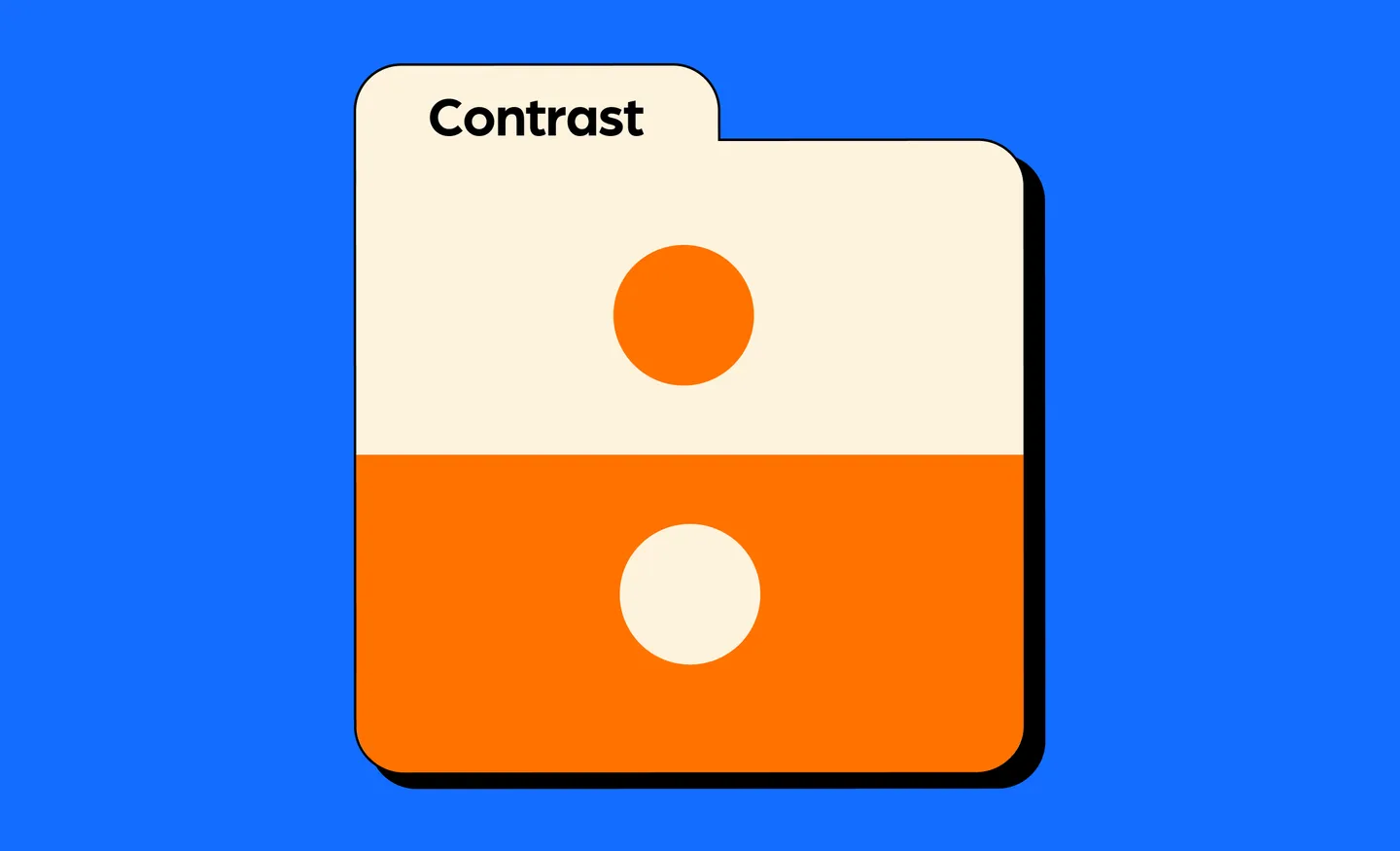
2. Contrast: The magical potion of emphasis
Contrast refers to the intentional juxtaposition of elements to create visual interest and emphasize certain areas of a design. Contrast involves juxtaposing different elements to create visual interest and draw attention to specific areas. It's the spell that ensures your design doesn't blend into the background. Here are a few examples:
Color contrast: Pairing vibrant hues with muted tones or complementary colors can make elements pop and grab the viewer's eye. Think of the bright red "Play" button on YouTube's interface against the white background.
Size contrast: Playing with varying sizes of elements allows you to establish a visual hierarchy. A large headline followed by smaller subheadings guides the reader's attention through an article.
Typography contrast: Experimenting with different font styles, weights, and sizes can add depth and emphasis to your text. Consider how a bold, condensed font creates impact in a movie poster compared to a delicate script font used for the credits.
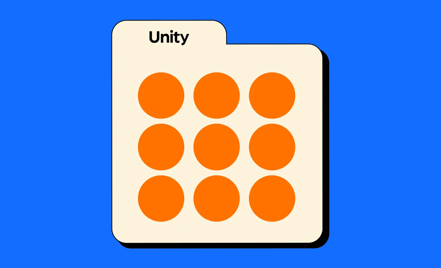
3. Unity: The thread that binds
Imagine designing a jigsaw puzzle, where each piece fits seamlessly with the others to create a complete picture. Unity is the principle that ensures all elements in your design work harmoniously together, conveying a cohesive message. Here's how to achieve it:
Consistency: Use consistent colors, fonts, and styles throughout your design to establish a visual identity. This helps create a sense of unity and brand recognition. Apple's sleek and minimalistic product designs exemplify this principle.
Repetition: Repeating certain design elements like shapes, patterns, or icons reinforces the overall theme. It ties everything together, making the design feel intentional and well-crafted.
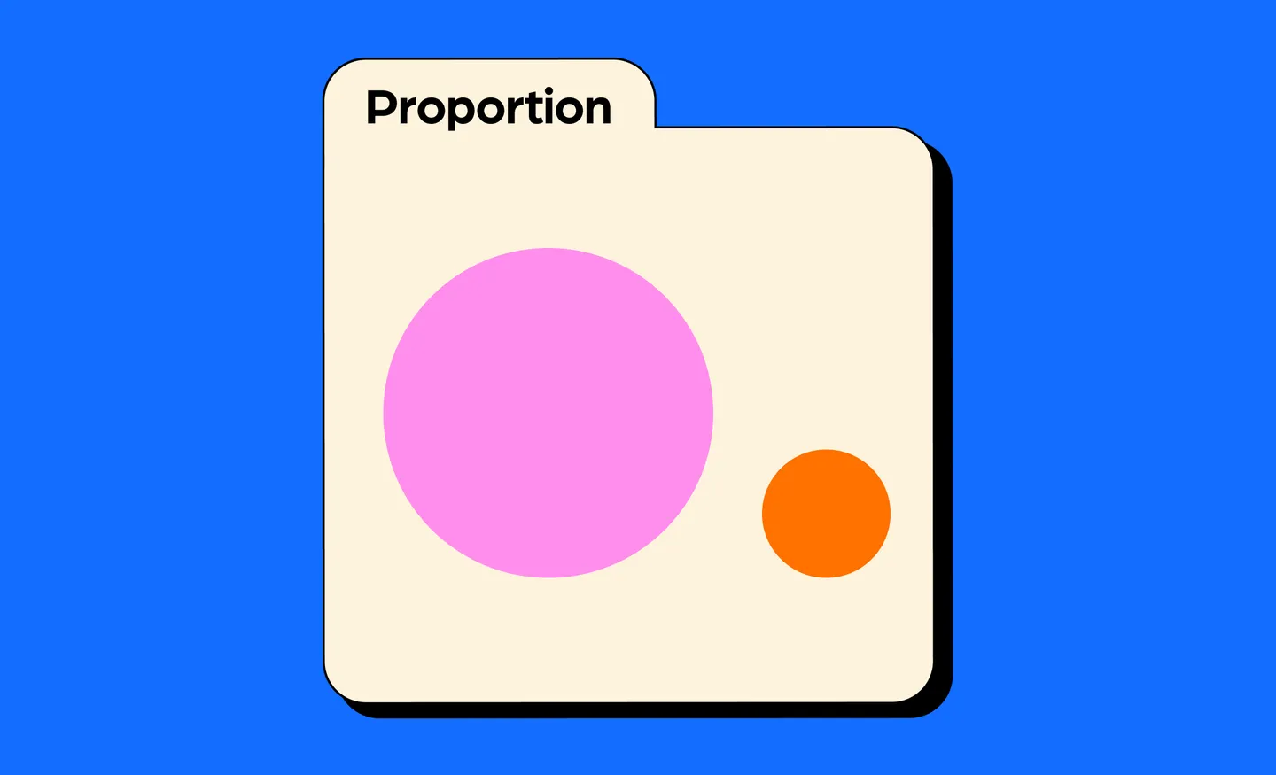
4. Proportion: The art of scaling
In the magical realm of design, proportion reigns supreme. It involves finding the right size and scale for each element, ensuring they relate harmoniously to one another. Let's explore two aspects of proportion:
Golden ratio: This mystical mathematical formula, often found in nature and art, helps achieve aesthetically pleasing proportions. Applying the golden ratio can lead to balanced layouts, such as in the design of Apple's iPhones or in the composition of Leonardo da Vinci's "Mona Lisa."
White space: Don't underestimate the power of emptiness! White space, also known as negative space, refers to the areas of a design without content. It helps create breathing room, allows elements to stand out, and enhances overall readability. The clean and spacious design of Google's search page is a perfect example.
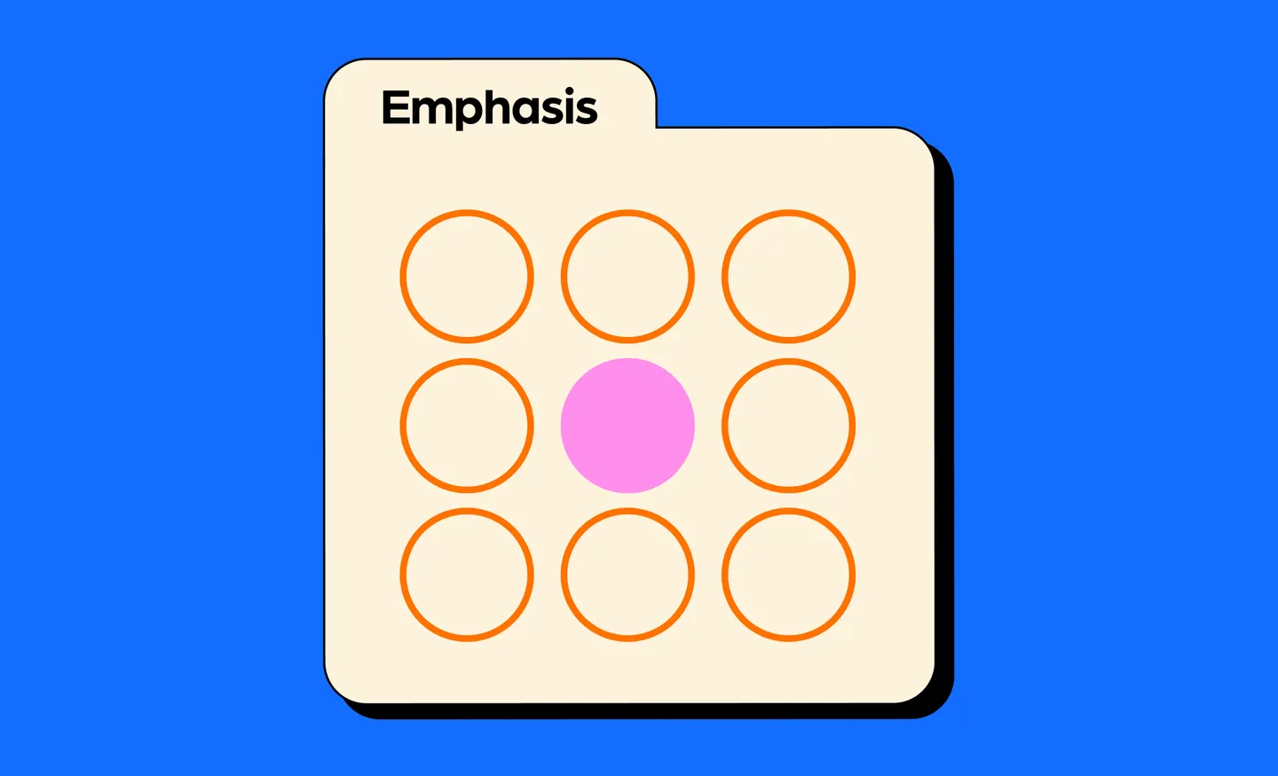
5. Emphasis: Directing the spotlight
In the design world, emphasis is the spotlight that shines on the star of the show. It guides the viewer's eye to the most important elements, creating hierarchy and visual impact. Here are a couple of techniques to master emphasis:
Contrast and color: By utilizing contrast and color, you can make certain elements stand out from the rest. A vibrant call-to-action button against a neutral background instantly grabs attention.
Focal point: Establishing a focal point directs the viewer's gaze to a specific area. It could be a compelling image, a bold headline, or a central illustration. For example, think of a photograph where a single bright red apple sits among a pile of green apples. That red apple, being distinct and vibrant, naturally captures the viewer's attention amidst the sea of green, emphasizing its significance in the image.
Some final tips for better design
By understanding and applying these basic principles of design, you'll have a solid foundation for creating visually appealing, cohesive, and effective designs.
Through embracing these five fundamental principles of design—balance, contrast, unity, proportion, and emphasis—you'll wield a powerful arsenal of tools to create captivating and effective designs.
Additionally, here are some final tips to keep in mind as you embark on your design journey:
Keep it simple: Simplicity is often the key to creating impactful designs. Avoid cluttering your compositions with unnecessary elements. Embrace minimalism and let the essential elements shine.
Experiment and iterate: Don't be afraid to try new ideas and explore different approaches. Design is a process of iteration and refinement. Experiment with various layouts, color palettes, and typography until you find the perfect combination that brings your vision to life.
Know your audience: Understand who you're designing for and tailor your designs accordingly. Consider their preferences, expectations, and demographics. By creating designs that resonate with your target audience, you increase the chances of achieving your desired impact.
Seek inspiration: Inspiration can come from various sources. Explore design blogs, visit art exhibitions, browse through magazines, or simply observe the world around you. Collect a diverse range of inspiration to fuel your creativity and spark new ideas.
Remember to experiment, practice, and let your creativity flow to unlock the true magic of design. After all, design is a journey of continuous learning and growth!