


Resources
Build a better UI with these important factors to consider.
It’s no secret that color matters when it comes to user interface (UI) design. Certain colors affect our mood such as how warm colors can evoke contrasting emotions of warmth and anger.
In fact, research revealed that 84.7% of respondents stated that colors account for more than half of the various factors when choosing products. On top of that, people make a subconscious judgment about a person, environment, or product within 90 seconds of the initial viewing, where 90% of that is based on color alone.
Hence, colors in UI design are crucial in order to make an impact on users. They can draw attention, create hierarchy, and convey meaning. So, here are five things to note about colors in UI design.
Color theory is important for UI designers as it helps you understand how colors interact with each other and how they can be used to create specific visual effects. This is where the good ol’ color wheel comes to play. The color wheel, invented by Sir Isaac Newton, categorizes color into three different groups of primary (red, green, and blue), secondary, and tertiary colors.
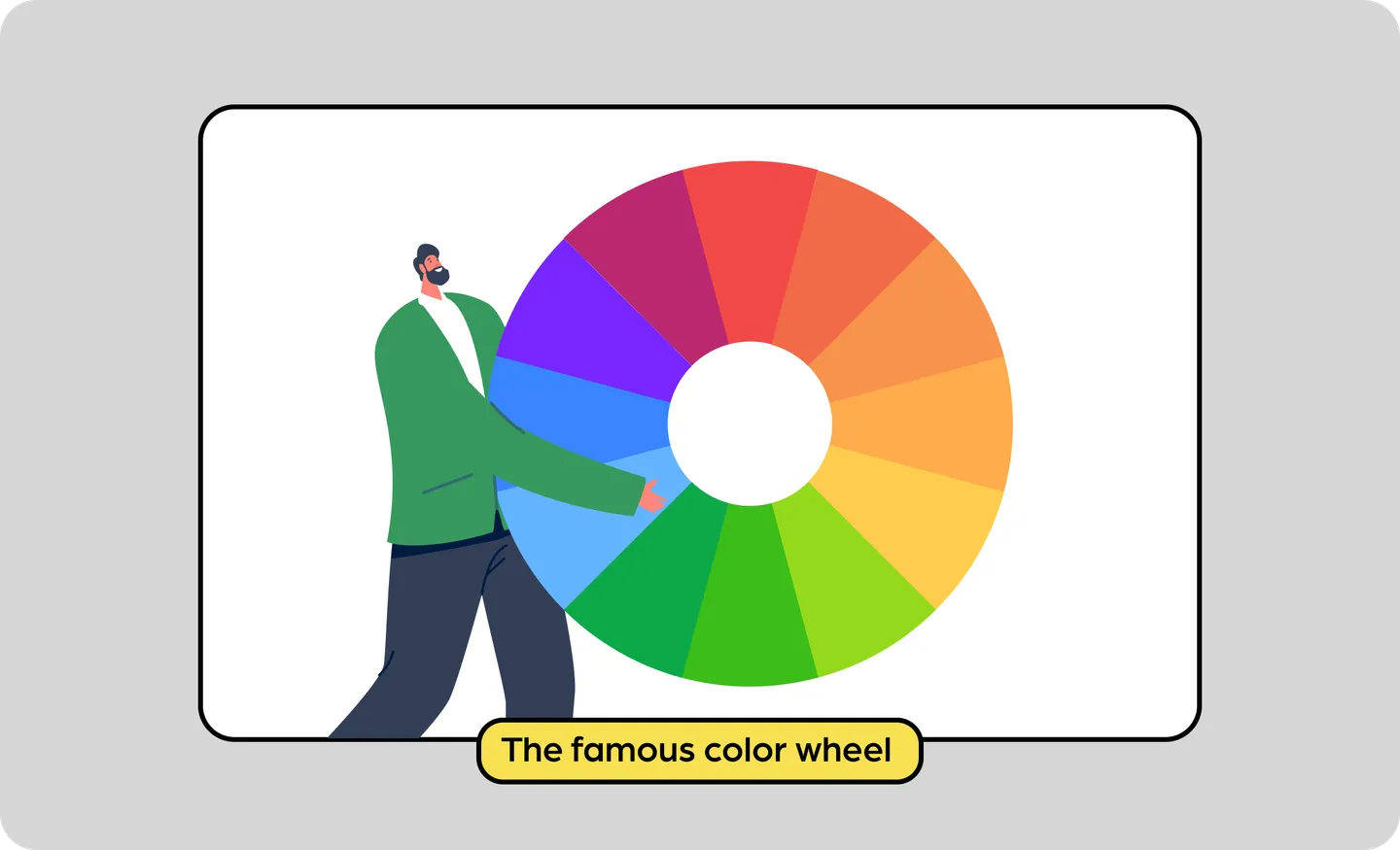
Primary colors are not to be mixed, while secondary colors are a mix of primary colors, and tertiary colors are a mix of shades in both primary and secondary color tiers.
The color wheel is a way to identify color combos including how warm and cool colors can be balanced. It shows the relationship between different colors and you can use this to decide design factors such as complementary colors or monochromatic color schemes. With this, you can create balanced designs that are visually pleasing.
Here are some examples of different color harmonies:

Apart from that, here are some other things to note about color theory:
There are two things to think about here - color psychology and cultural color meanings. Color psychology is the effect colors have on us. Colors evoke meaning, which means different colors have varying effects on our emotion and how we associate with them.
For colors in UI design, color hues can be used to influence user perception and engagement with the product of a website. Choosing a color hue - which is the purest and natural form of color - is important as warm hues like red, orange, and yellow can create a sense of energy, excitement or warmth. Meanwhile, cooler hues such as blue, green, and purple create a sense of calm and trust.

Hence, understanding these associations helps UI designers choose colors that align with what they want to convey. For example, an urgent message could use warmer hues, while information or design that is product-specific can use cooler tones.
However, color psychology is not an exact science. Different cultures may associate colors with different meanings. For example, red in Chinese culture symbolizes luck, joy, and happiness, while red in Indian culture is associated with purity. Thus, when designing for a specific market or ethnic group, consider the color hues together with its associations for a greater impact.
When using colors in UI design, the contrast of color refers to the difference in lightness and saturation of two colors. High contrast can help you highlight certain elements, while a lower contrast creates a more subtle and harmonious look.
One of our tips is to use a color contrast checker such as WebAIM Contrast Checker Tool to check the colors you want to use and make sure your design is optimized for users. But elements such as your brand logo or decorative areas do not matter in terms of contrast because they serve no significant user purpose.
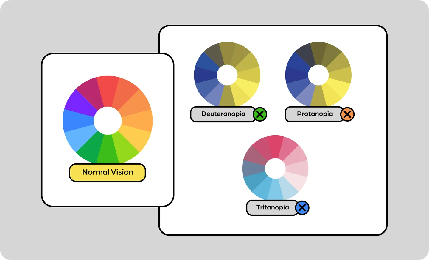
Color contrasts are mostly used in text when it comes to UI design. It is also to make the UI design more accessible to everyone - including those who might have vision impairments such as color blindness.
When designing with color blindness in mind, the two simple rules as outlined by We Are Colorblind, are:
In UI design, it’s definitely not a “one size fits all” situation. The best way to approach this is with user testing on your actual audience pool to give you insight on what improvements should be made.
Colors are a reflection of a brand’s personality and identity. With that, it is always good to bear in mind your brand’s color palette when designing the interface. Here are some simples rules to abide by when incorporating brand colors for UI design:
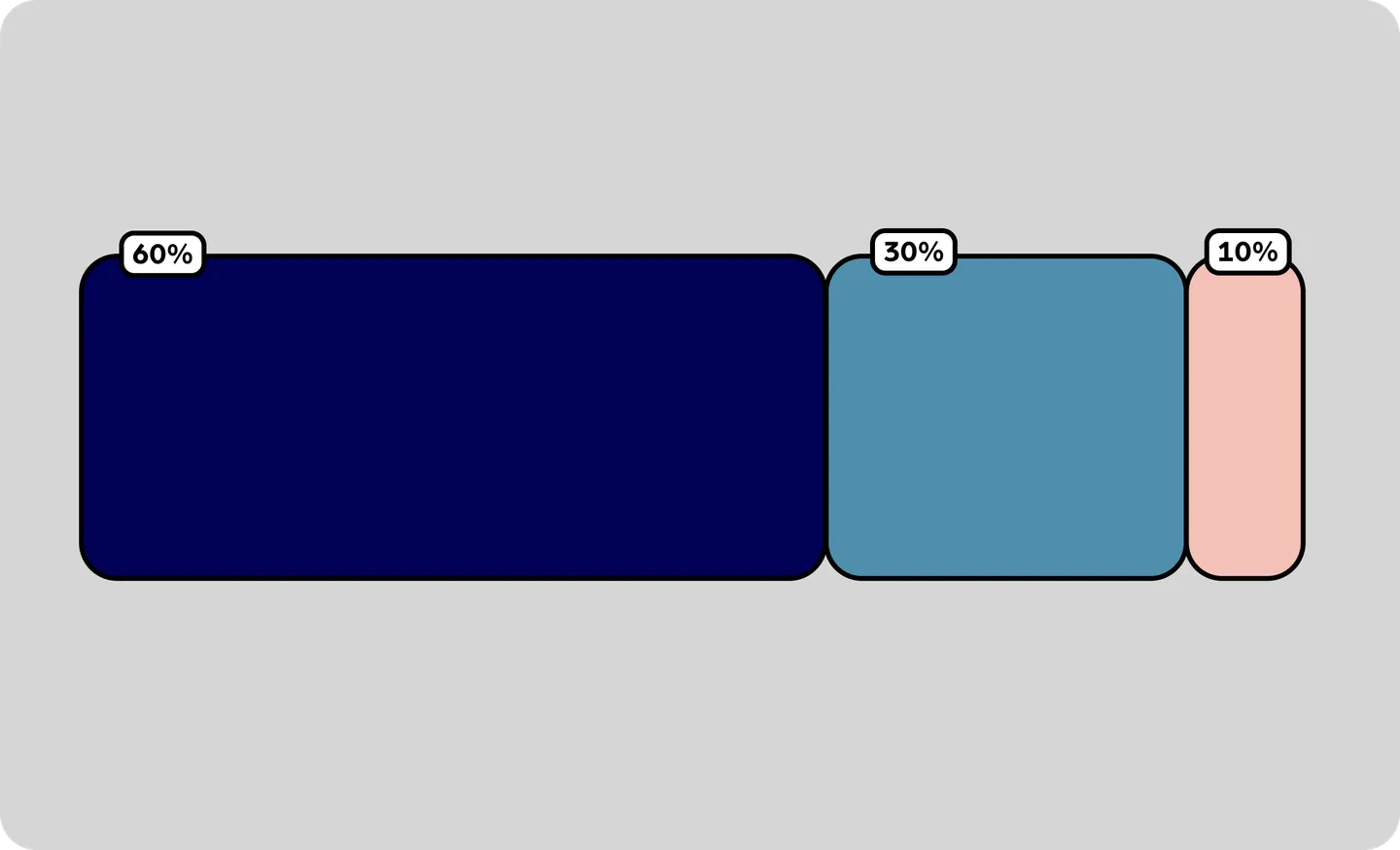
The principle of 60 percent + 30 percent + 10 percent is the best proportion to achieve color balance when it comes to implementing colors in UI design.
The rule goes like this: we have to choose a dominant color and use it in 60% of the space, a secondary color in 30%, and a final color in the remaining 10%.
The dominant color (60%) offers the background and forms the foundation of the color scheme, while the secondary color (30%) adds contrast and visual interest. Meanwhile, the 10% is the accent color that gives pops of color to draw the eye and add emphasis to certain elements.
But what is this rule for? It can ease the eye of users to move from one point to the next comfortably. In summary, the 60-30-10 rule is a color design guideline to create a balanced and harmonious color scheme that gives visual interest and structure to your UI.
If you are in the midst of finding the right colors for your UI design, here’s a tool to check out: IconScout’s Color Editor.
With IconScout’s Color Editor, you can easily apply custom colors, or use one of our preset color palettes in just a click. This is extremely helpful to match your brand guidelines and bring your design aesthetics to life. On top of that, if you are a subscriber, you can also apply your brand color palettes to the search results instantly when looking for a design asset with us.
And if you are stuck on finding the best color palette to begin with, read 15 Best Color Palette Generators for Any Design Project which lists color palette generator tools for you!

