Resources
Color combos determine the visual cohesion and appeal of any artwork.

Color combinations, often referred to as color harmonies or schemes, play an essential role in design. They determine the visual cohesion and appeal of any artwork, whether digital or printed.
Proper color combos can evoke emotion, capture attention, and even convey messages without words. This article delves into the different types of color combinations with tips and tricks for mastering the art of choosing the perfect palettes.
Derived from a single base hue, monochromatic palettes use various shades, tints, or tones of that hue to create a cohesive and harmonious design.
This choice is elegant in its simplicity, offering a uniformity that is easy on the eyes. It can bring depth to your designs by employing the diverse range within one color, ensuring your design remains both interesting and interconnected.
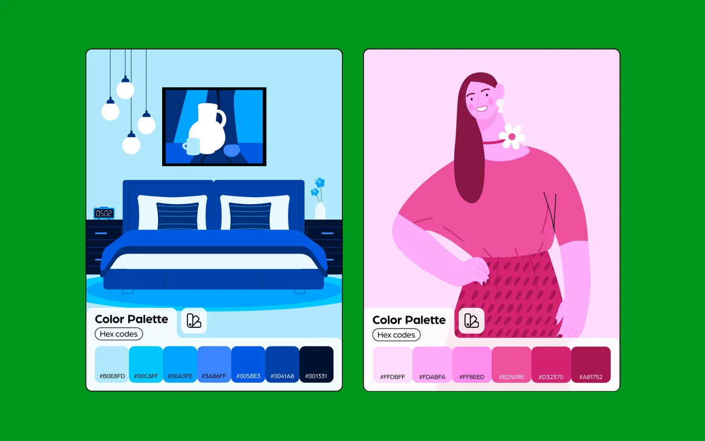
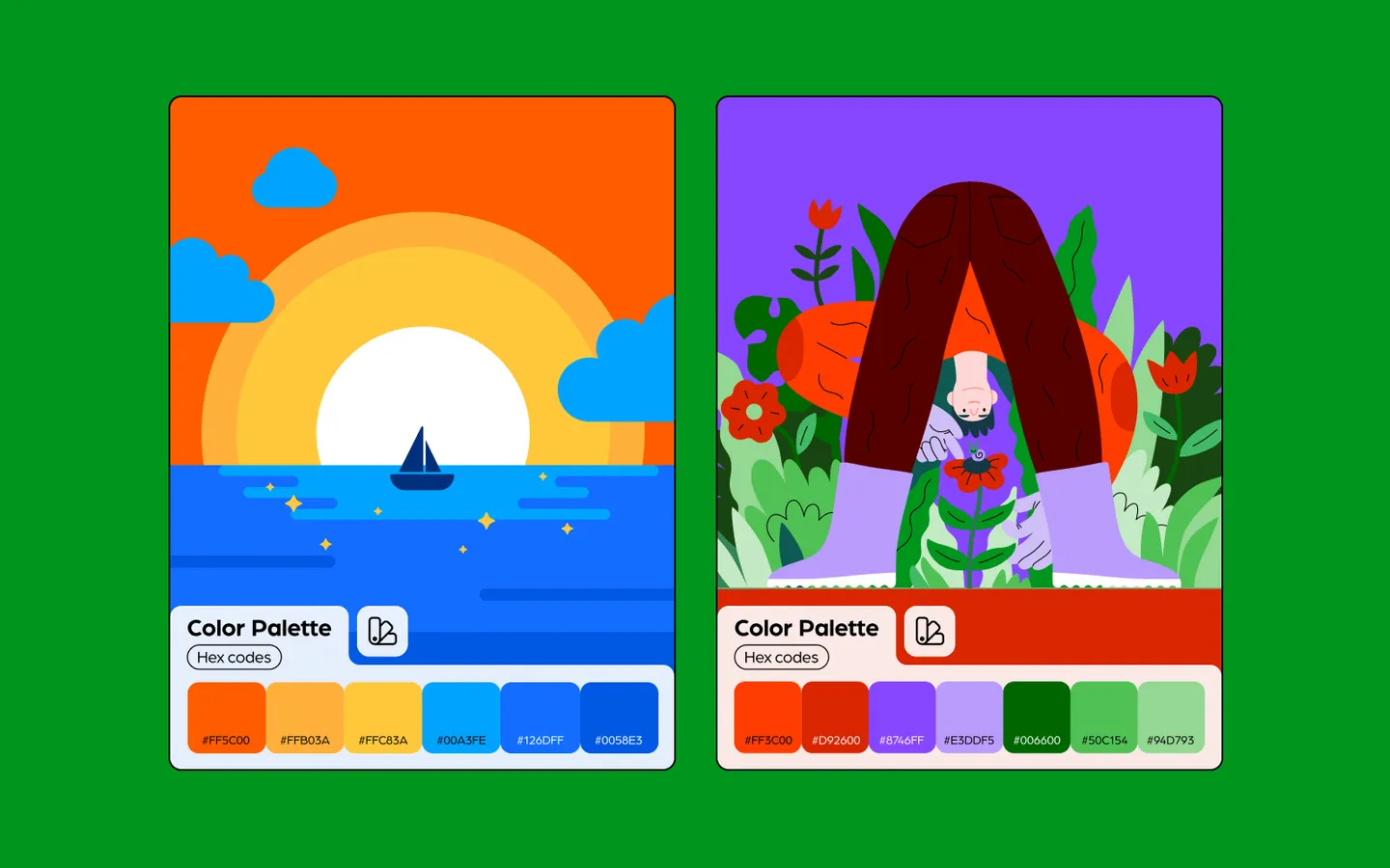
Examples:
These palettes utilize colors positioned opposite each other on the color wheel, like blue and orange or red and green.
The contrast between these colors creates a vibrant look, especially when used at full saturation. Complementary colors work best when used in small doses or when one color dominates and the other acts as an accent.
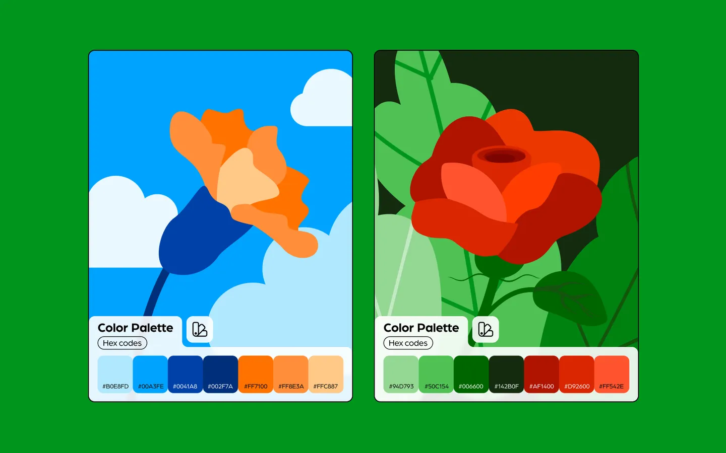
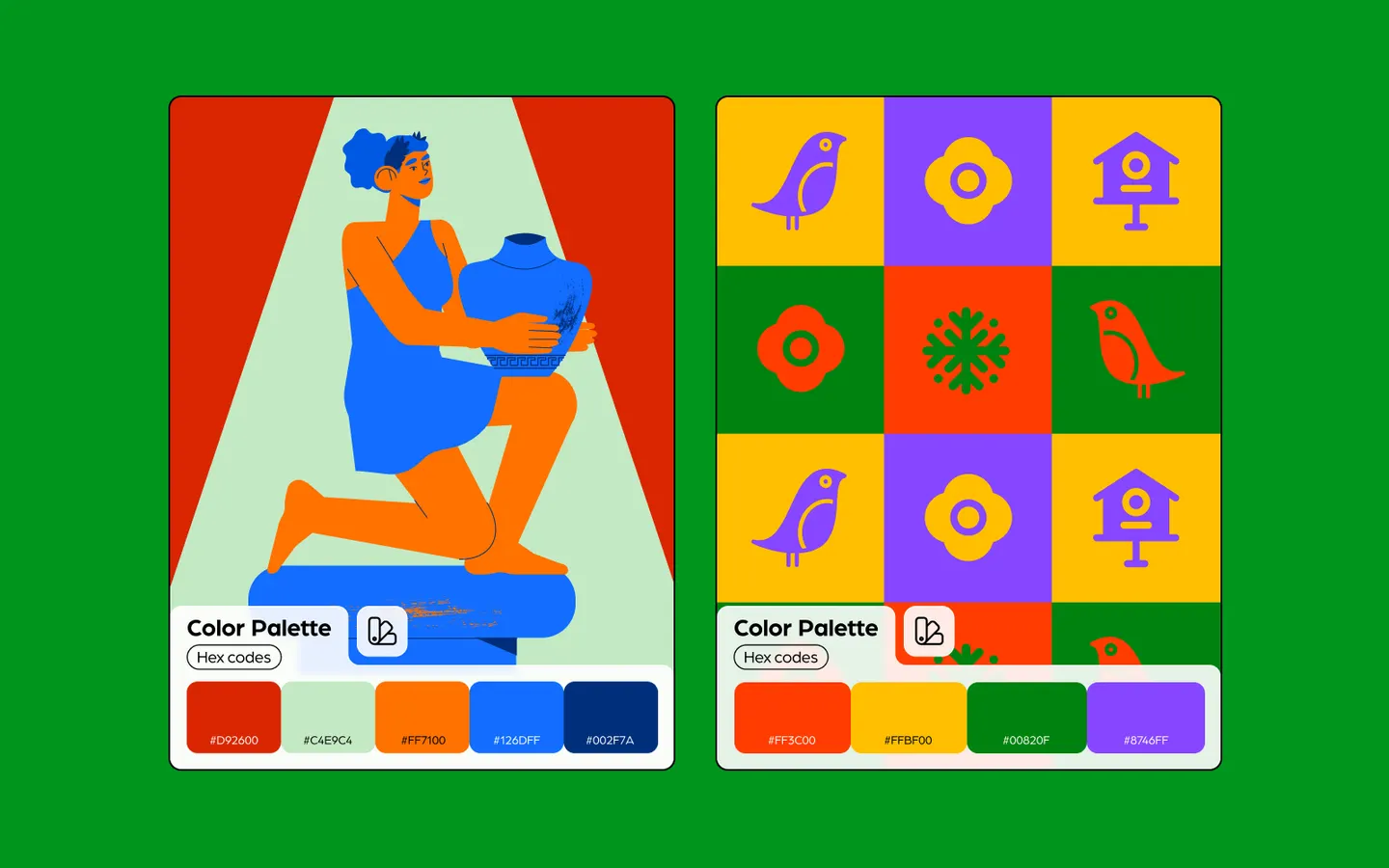
Examples:
Analogous colors sit next to each other on the color wheel. Think of reds alongside oranges or blues transitioning into purples.
They naturally harmonize, given their proximity, creating a serene and comfortable design. They're excellent for creating a calm, predictable feel, but it's essential to ensure sufficient contrast between them when used in design to keep things distinct.
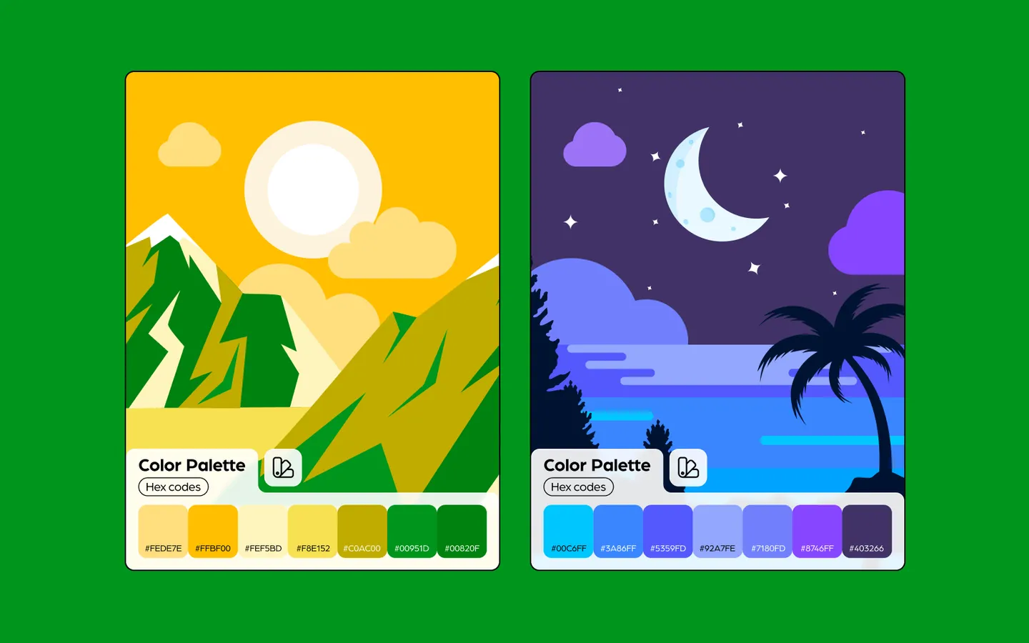
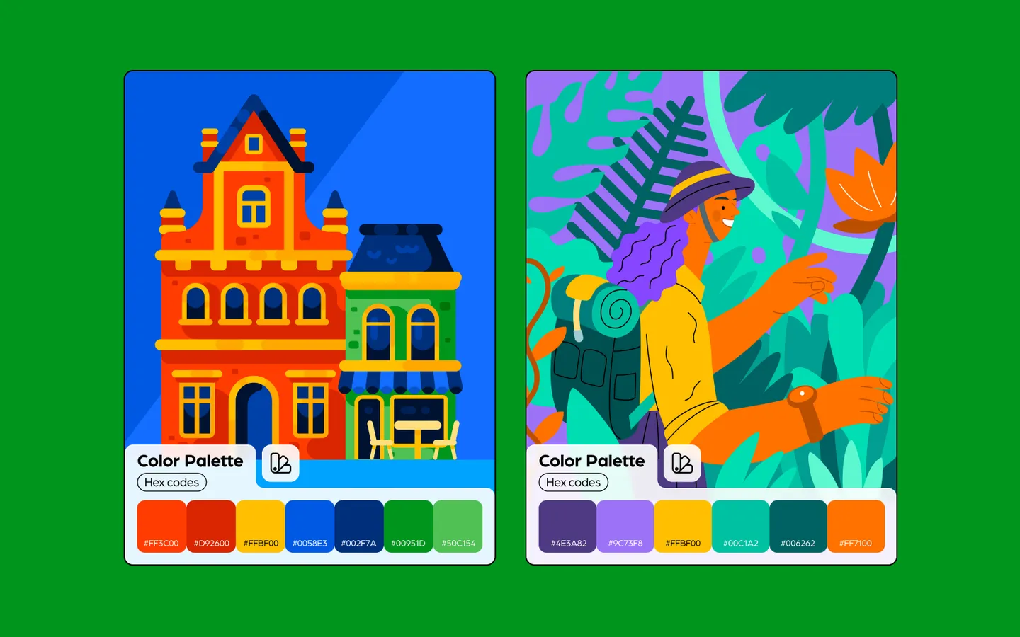
Examples:
A dynamic and vibrant choice, triadic palettes use three evenly spaced colors around the color wheel. Take for instance, the primary colors red, blue, and yellow, or the secondary ones green, orange, and purple.
The key to harnessing the energy of these combinations without overwhelming the viewer is balance; one color should dominate, with the other two accenting.
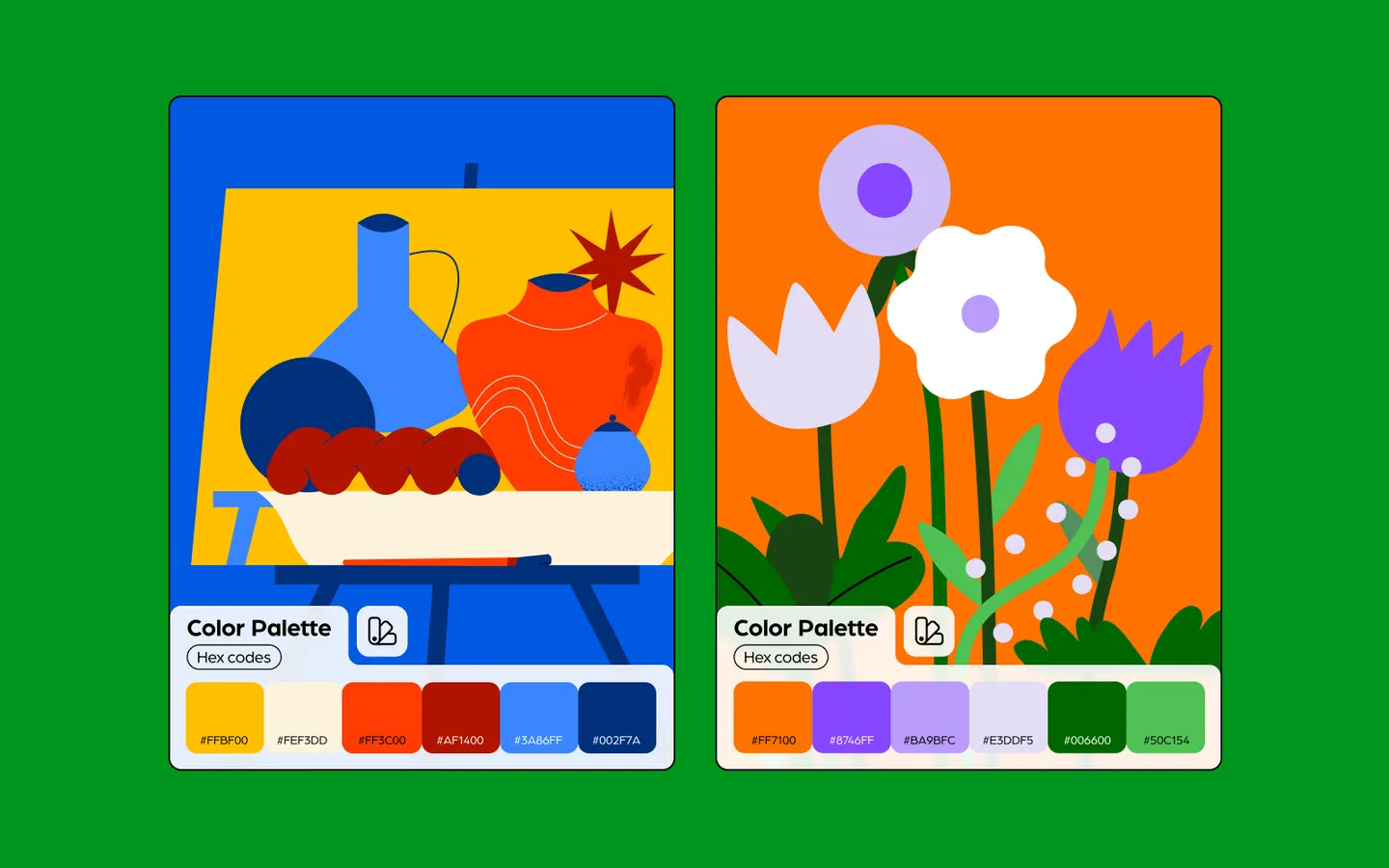
Examples:
A variation of the complementary scheme, split-complementary uses a base color and the two adjacent colors to its complement. For instance, blue combined with yellow-orange and red-orange.
This provides the visual interest of the complementary scheme but with less tension, creating a fine balance between contrast and harmony.
Examples:
One of the richest color schemes, tetradic involves four colors - comprising two complementary pairs. It's versatile but challenging, as the abundance of colors can disrupt harmony.
The trick is to let one color dominate and use the others for accent, ensuring a balanced, harmonious look while leveraging the richness of four distinct hues.
Examples:
This scheme employs four colors spaced evenly around the color wheel. While it provides variety, it can also be challenging, akin to the tetradic scheme.
Maintaining balance is crucial; typically, one color should take precedence, with others serving as support or accent.
Examples:
Color combinations are a testament to the vast expressive potential of design. By understanding these combinations' nuances, designers can craft visuals that resonate, engage, and communicate effectively.
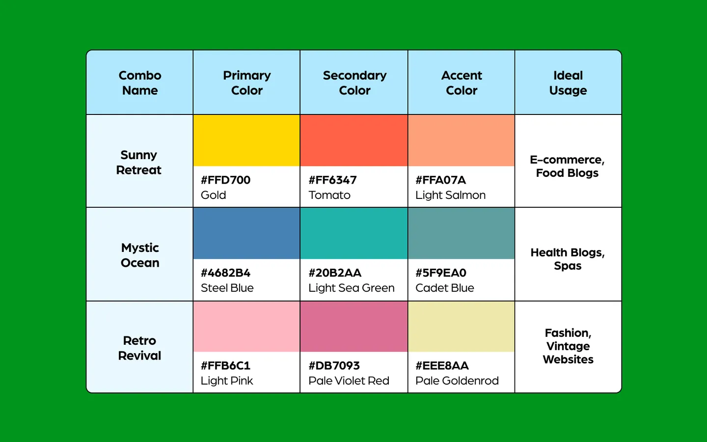
If you are embarking on a new project and searching for the perfect hue, we’ve drawn up a table with some curated color combos and their ideal usage.
As we draw this colorful journey to a close, it’s clear that the world of color combinations is not just vibrant and diverse, but also deeply influential in setting the mood and evoking emotions.
So, here are some tips and tricks to help you.
As you step forward into your next project, we encourage you to play, explore, and even step out of your comfort zone with these color combos.
Remember, every color tells a story; it's up to you to create a narrative that resonates. Here's to painting a brighter, more colorful future, one project at a time!