


design
Explore how you can use icons to improve your designs.

In developing a digital brand’s visual identity, designers must navigate a balance between innovative design that catches the eye and effective communication elements. Effective design captivates while clearly conveying key messages, shaping a user’s experience and drawing them into the brand’s narrative. Through strategic, engaging visuals, designers can ensure the brand resonates deeply with its audience.
One small, yet impactful way to communicate is the use of icons. Visually, the human brain processes images 60,000 times faster than text, making visual content a rapid and efficient way to communicate. In this article, we will explore ways you can effectively use icons in your design, whether it be your websites, mobile apps or any other digital platform.
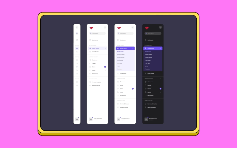
Incorporating icons into the navigation bar is a strategic choice that enhances information delivery for users. By enabling quick visual scanning, icons streamline navigation, significantly reducing the time it takes to find information. This approach not only minimizes visual clutter but also smartly categorizes data, facilitating user interaction.
Take, for instance, the commonly adopted "collapsed" view on many websites. This design choice preserves essential screen real estate by only expanding to show full text when a user hovers over an icon. This feature becomes intuitive over time, especially for frequent users, helping to clarify any potential ambiguities for those less familiar with the interface.
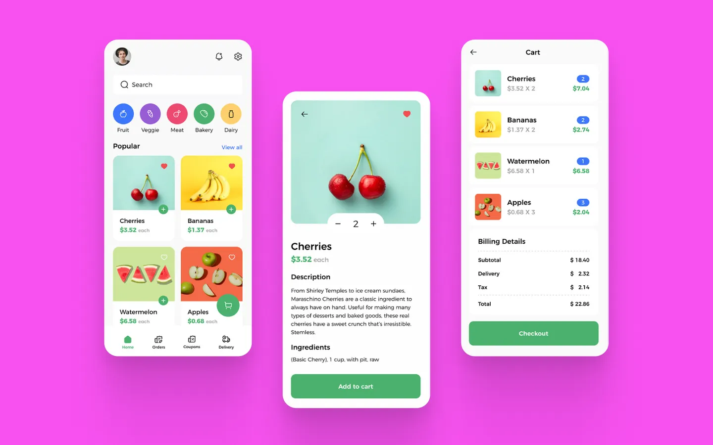
Using icons effectively draws attention to key features, such as highlighting critical functionalities on a dashboard, making them immediately recognizable. While numbered lists and bullet points help declutter text and organize information neatly, incorporating iconography can also offer a visual representation of the text. This subtle visual explanation enhances understanding and engages users by breaking up text-heavy content, making key points more accessible and visually appealing.
Using icons in listicles adds an extra layer of interest to the information presented. If the icons are ambiguous, accompanying text can clarify their meaning. Lists can also be designed as interactive drop-down menus that collapse once the user is done, further decluttering the space. This method not only enhances the visual appeal but also improves user interaction by simplifying and organizing the content effectively.
Item or list buttons are excellent tools for categorizing similar objects within a single area. Incorporating icons into these buttons allows users to quickly identify the type of objects grouped together, enhancing visual recognition. This approach not only provides clear visual cues but also enhances visual appeal. As a result, interfaces become more engaging and intuitive for navigation.
Action buttons like play, pause, rewind, and fast-forward employ universally understood icons, favoring minimalism and familiarity in their design. This choice reflects a classic approach that transcends cultural and linguistic barriers, providing an intuitive user experience. The simplicity of these icons is not just aesthetically pleasing; it's practical, ensuring seamless interaction across various digital platforms and devices.
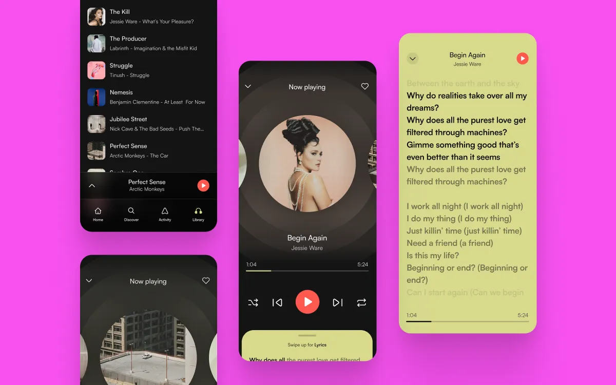
In mobile design, it's common practice to place the navigation bar at the bottom of the screen, mirroring the function of website navigation bars. Tapping on an icon in this bottom navigation bar instantly transports you to the related view or refreshes the view if it's already active. Each icon is directly linked to a specific destination and is designed to avoid opening menus or dialogs, ensuring a seamless and direct interaction for the user.
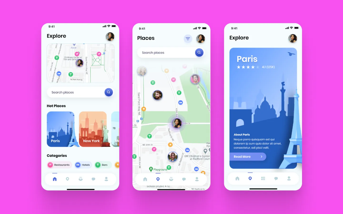
⭐ Here’s a little bonus: Have you noticed the use of icons on maps? The clever deployment of simple icons like a little bed for hotels, a cocktail glass for bars, a fork and spoon for restaurants, and a cart for shopping centers is a brilliant way to indicate locations without cluttering the map with text. This method enhances the visual cleanliness of the map, making it easier and more intuitive for users to navigate.
From the above examples, you may have noticed that in some cases, icons alone are not sufficient and need some sort of text to accompany them to ensure the context is fully understood. This is because there are icons we are super familiar with and some icons which can be not so family
Consider the icons displayed above. Chances are, you recognize most, if not all, of them. This familiarity stems from their ubiquitous presence across various digital platforms, whether in apps, websites, or any digital interface, transcending the bounds of specific companies or industries. Common icons like “Home,” “Favorite,” “Comment,” “Menu,” “Refresh,” and “Settings” are staples on many screens.
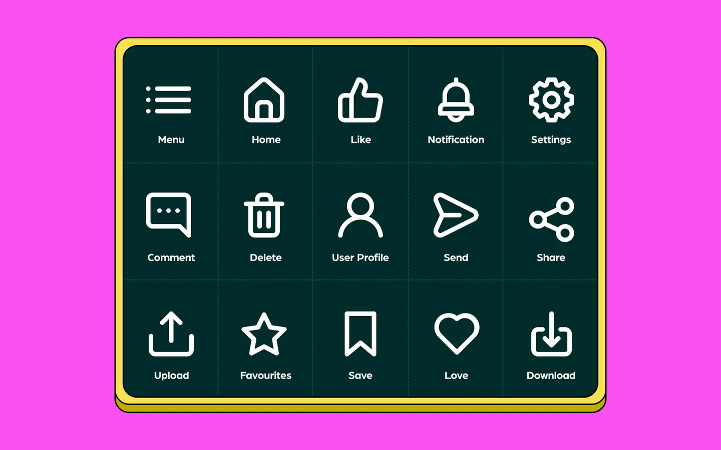
While certain brands might add their unique twist—consider Facebook and YouTube's thumbs-up icon versus Instagram, Twitter, and TikTok’s heart, or the star in Google Chrome—these symbols, though varied, convey similar meanings. Similarly, the share icon can appear as a box with an arrow, a paper airplane, or a trio of connected circles. Despite these variations, their meanings remain clear and recognizable due to our frequent interaction with them. In such contexts, additional text explanations are often unnecessary.
Let's revisit the heart icon. For some, its meaning may not be as intuitive as one might assume. It's interesting to note that this icon could cause confusion for users—is it meant to indicate a "like" or "add to favorites"? Recognizing such uncertainty highlights the importance of using icons that are more universally understood and easily interpreted.
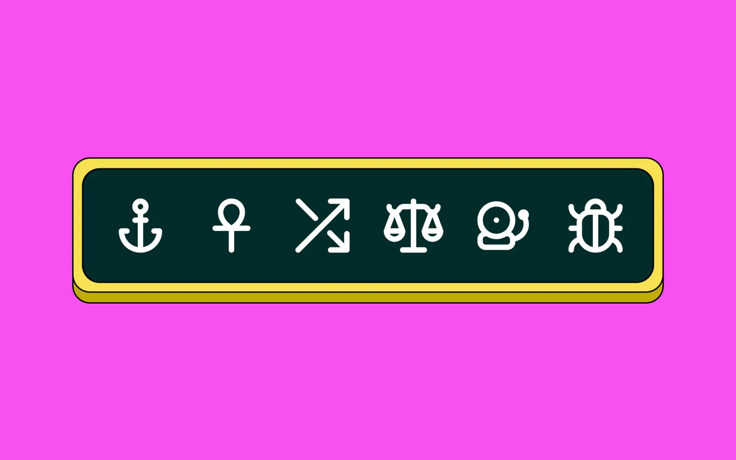
For niche products or apps, the use of unique, specialized icons that aren't found elsewhere might be necessary. See the icons below; their functions aren't immediately clear at first glance. In such cases, incorporating labels can be incredibly beneficial. Labels aid users in becoming familiar with the interface, making navigation intuitive over time. time. This strategy not only improves the user experience but also ensures clarity and usability.
Now that we've explored the versatile world of icons, it's time to find the perfect fit for your project. Integrating icons into your websites, apps, and other digital platforms is seamless with icon fonts—a type of font comprised solely of icon glyphs rather than alphanumeric characters. These are favored by web designers for their ease of styling with CSS, just like regular text.
For those who prefer more flexibility in editing, SVG icons are an excellent choice. These can be incorporated into popular design tools like Figma, enhancing your creative workflow. If you're looking to add a dynamic touch, consider exploring stylized options such as 3D icons and Lottie animated icons.
All these options are readily available within the IconScout’s Unicon library, which boasts over 7,000+ customizable icons. Hope you find this guide insightful and that it assists you in making the most of your digital designs.