Resources
Here is a list of top 10 design trends to look for in the year of 2018. We hope you enjoy this blog!
Written by Jennis Tanwar for Yellow Media Labs
With every new year, new trends emerge. Last year’s trends pave way for this year’s trends. Reviewing previous trends, here is a compilation of a list of design features which have the potential to be big this year. 2018 will be a year of modernizing graphic design trends from the past and diverging from the (literally) flat design landscape of recent years. Minimalism and simplification will stick around but expect to see some old favorites make their return to the limelight with modern, updated looks. Without further ado, here are the top predictions for 2018.
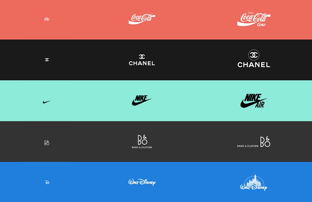
With the endless assortment of devices and screen sizes, a need for adaptable designs arose. It is no longer sufficient to create one logo and scale it down according to the varying screen size. Logos now need to be adaptive according to its usability. Responsive design has now become the industry standard. Companies have been refreshing their logos into modern, simplified versions over the past few years and responsive logo design is the logical next step in meeting the demands of today.
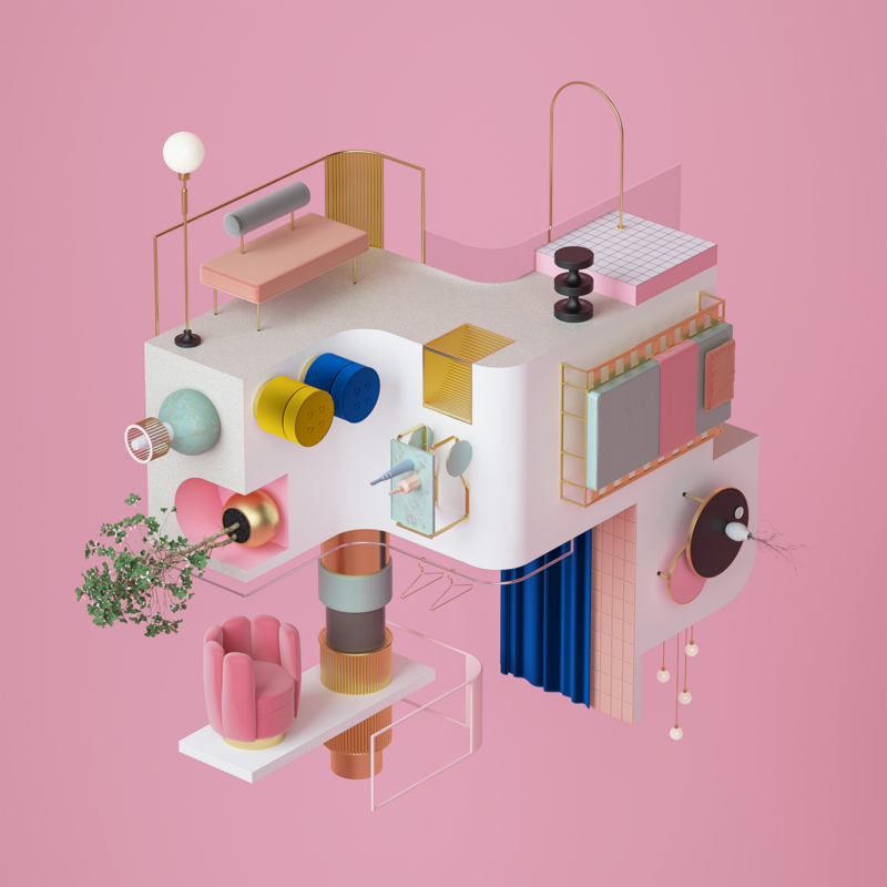
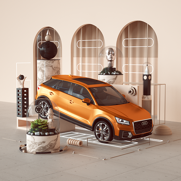
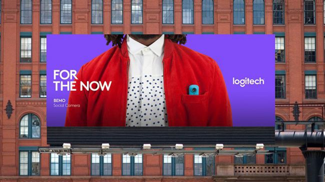
With the increase in 3D projects, many designers have now started incorporating 3D in the logo and product placement. The use of high-end, styled and modern-looking still life was everywhere in 2017. The style is contemporary, geometrical and a bit abstract. This trend will be even more popular in 2018, especially in fashion and luxury market.
Custom graphic art and illustration had taken a backseat to cheaper stock imagery alternatives for much of the last decade. Hand-drawn images have been particularly big in 2017. Custom art or typography provides a personal touch to branding and marketing. It goes hand in hand with the movement of artisan approach from a very technical one. With the introduction of new tools such as stylus, tablets and new apps, it has become easier to digitize hand-drawn designs and typefaces. In a world ever-more dominated by screens, this trend will resonate with many.
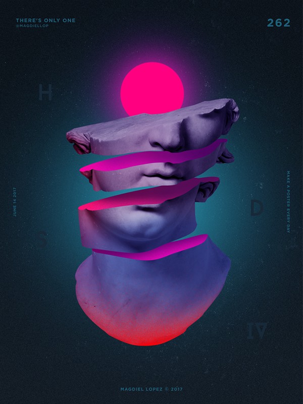
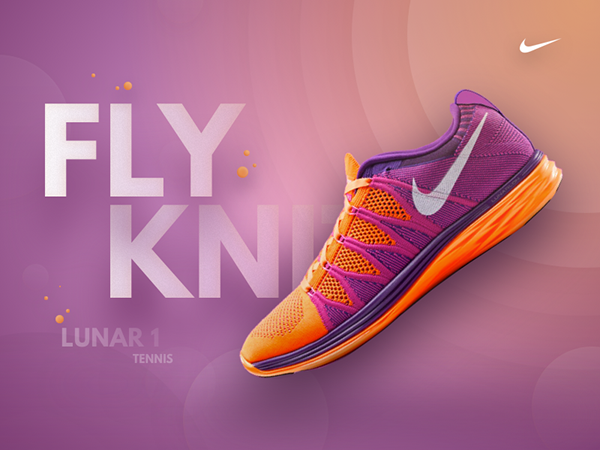
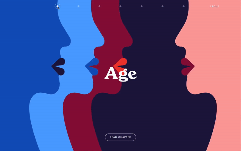
2017 has been a riot of color, with graphic designers making big, bold choices. Fluorescent color and clashing tones have become mainstream. The use of bright and vivid colors in combination with a variety of textures will become popular. Gradients made a comeback in recent years and this trend is going to continue and diversify. Gradients are being used for flat design enhancement in the form of vibrant UI, branding, backgrounds, illustrations, and overlays. This can be seen as a response to minimalism and material design in the previous years.
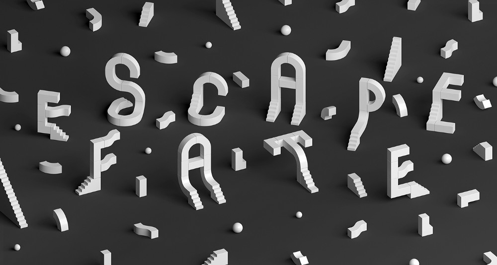
With the rise in 3D designs, 3D typography has become popular as well. The 3D type will also have an animation to add to its appeal. The words leap off the screen thanks to the volume created by the 3D techniques. This technique is an effective means of both connecting with and impressing the audience.
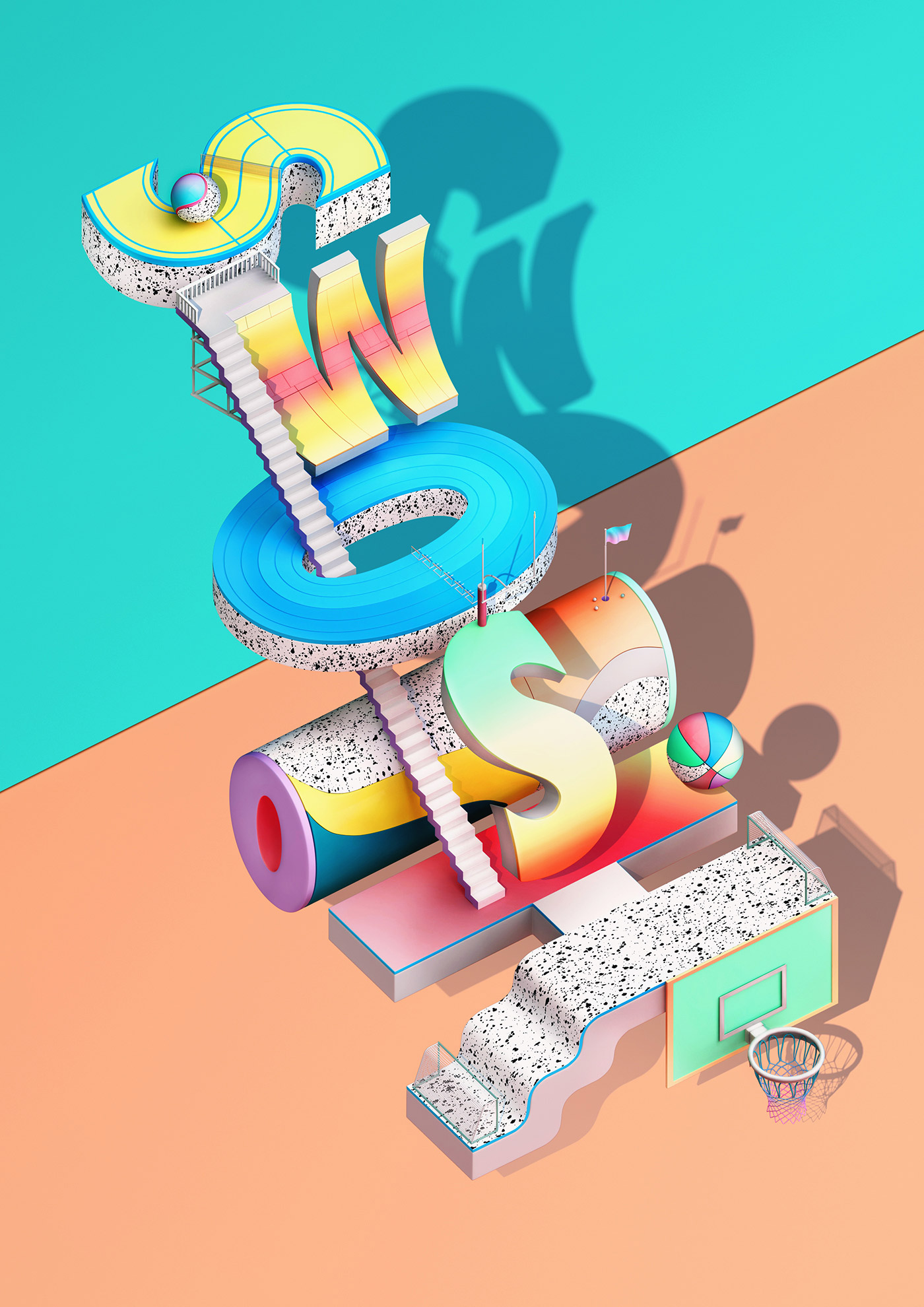
Shadows are officially back in 2018. Like gradients, shadows were put on the back burner as we stripped realism from our designs in favour of extreme minimalism and two-dimensional design. Depth is a valuable tool for helping users determine visual hierarchy, input fields and calls to action on screen. Unlike the over used long shadows in flat designs, real shadows give a more realistic feel to the whole design. They are being used to enhance icons, illustrations, apps, websites, etc.
Adding creative animations to micro-interactions is rapidly becoming popular. Interactive mouse pointers add another layer to a website’s user experience. The user controls the mouse pointer with specific interactions that are customized for the individual website. Gone are the days of websites using boring loading bars. Downtime of a website is now being used in a more creative way. Enhancing the user experience through tiny details will keep the user engaged with the brand. Interest in ads, email newsletters, illustrations, icons, and logos can be added by taking advantage of this trend. Animated GIF logos have really become a trend on their own as well.
When it comes to larger animations, GIFs and SVGs are valuable tools for communicating ideas, concepts and processes while making content more engaging for users. The cinemagraph is making a come back. These animated images are essentially still photos with a repeating video loop for only a selection of the image. Modern illustrations with a retro look are being used to make thoughtfully crafted animations by giving subtle movements which are intended to delight and allow for a more impactful storytelling. The animation will also be combined with type to grab attention.
Use of geometry in type has grown since 2017.Type is getting bigger, bolder and better. Due to the easy availability of well crafted geometric fonts, designers are opting for a bolder choice. Geometric sans serif fonts have the ability to be relatively ageless like most geometric designs. However, serif is also making a rapid reappearance on screen especially when paired with san serif fonts. There will be more experimental and artistic typography, more creative layouts and placements involving imagery, and bolder variations in alignment and be kerning.
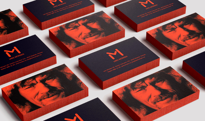
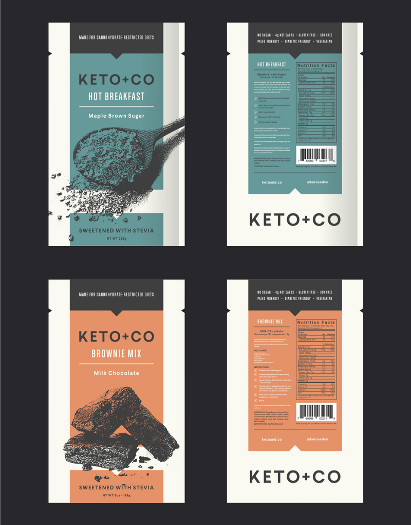
Imaging software has made it easier than ever to create duotones, as well as related variations like monotones, tritones, quad-tones and “fake duotones” (tinted images). Designers are taking advantage of this technique as imagery created within a limited colour palette is delightfully complimentary to semi-flat design. With bold colours and beautiful application possibilities, duotones is rapidly becoming popular in website and packaging design.
We are thankful to Yello Media Labs for sharing the article with us. You can follow them on Facebook, Instagram, and Twitter.
Don’t forget to check our latest article series ‘Design Insights’ where we are covering design process of best Indian startups. Check out our latest interview with Lollypop Design Studio. Don’t forget to share and subscribe! ?