


Resources
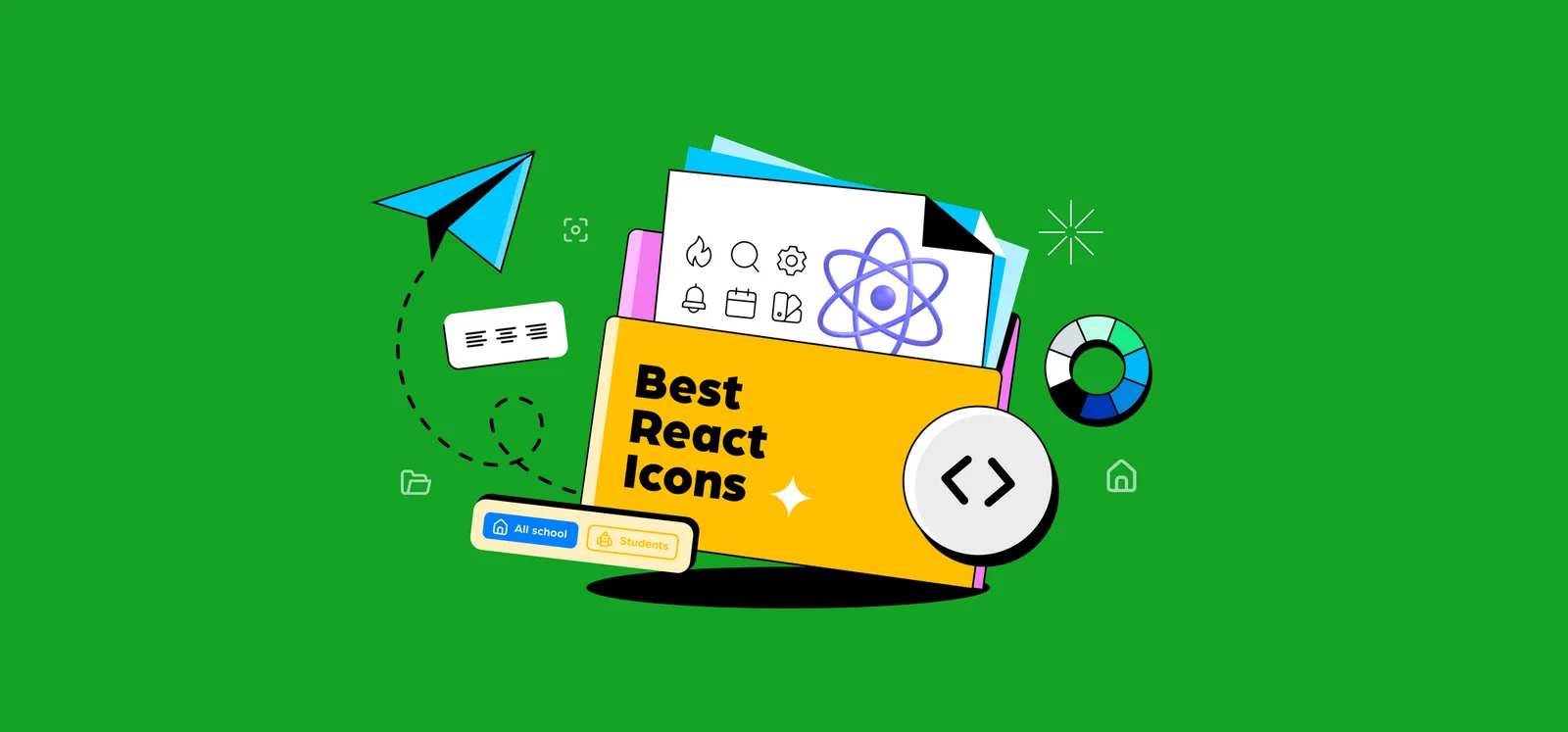
Design and develop your React projects faster with these awesome icon libraries.
This article was originally published on 14 September 2022, and has been updated on 27 July 2023.
Many elements make up a user interface (UI) of a website or mobile app. One of the most common – yet overlooked – among them include icons.
Icons are used in almost all websites, in different icon styles. They’re an important element as they improve navigation, explain functions and can even drive conversions.
And if you happen to be a React.js developer, you’re in luck – there are tons of React icon libraries out there that you can use to speed up your web development and design projects. For instance, if you’re ever wondering how to add material design icons, or how to add social icons in React, these libraries make it easy to find and import the right icons.
So here’s a list of some of the best React icon libraries, as well as how to install and use them.
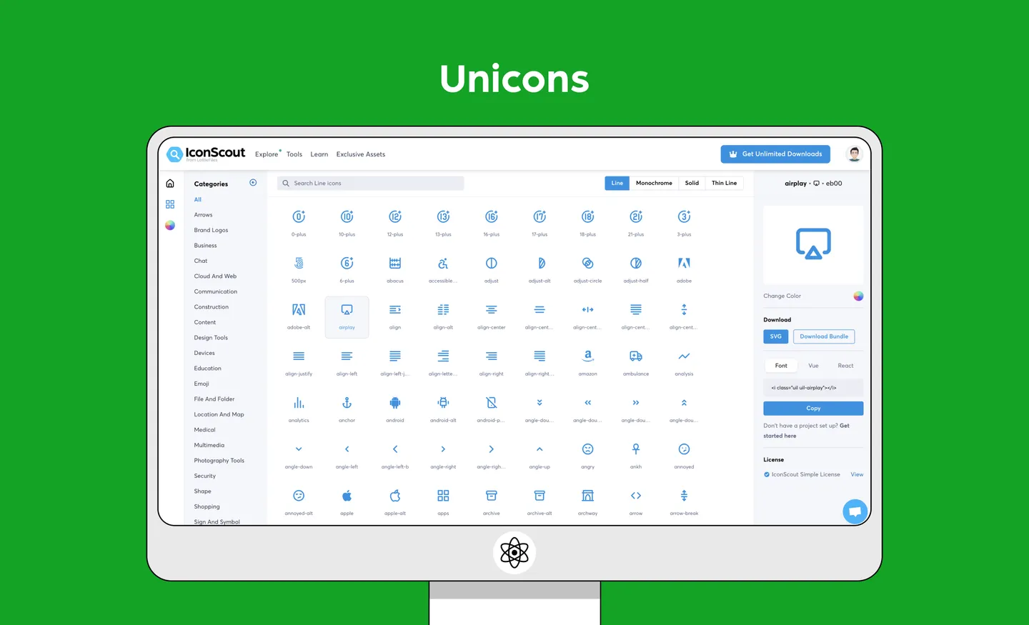
Unicons is an open source, free-to-use icon library designed by IconScout (yep, that’s us!). It provides thousands of icons in SVG or web font formats. These icons are all customizable, and are available in a few different styles: line, monochrome, solid and thin line.
So how do you use Unicons? You can download the React library, import it as CSS, use it as SVG files and as a font file. That’s not all – Unicons is also available on IconScout’s integrations with Adobe XD, Sketch, Figma, and more – so you can use the same set of icons in the design and development stages. Check out this guide to using Unicons for more information.
Features
Installation
yarn add @iconscout/react-uniconsor
npm install --save @iconscout/react-uniconsExample usage
// use individual icons

import React from 'react';
import UilReact from '@iconscout/react-unicons/icons/uil-react'

const App = () => {
  return <UilReact size="140" color="#61DAFB" />
};

export default App;

// or use as a full package

import React from 'react';
import * as Unicons from '@iconscout/react-unicons';

const App = () => {
  return <Unicons.UilReact />
};

export default App;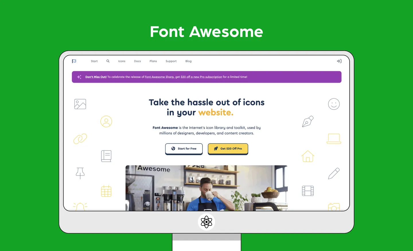
Font Awesome is a popular icon library, with over 2,000 free and open-source icons. It also offers a pro subscription starting at $79 a year, which gives you access to almost 20,000 icons. These icons can be customized with different sizes and colors.
Features
Installation
npm i --save @fortawesome/fontawesome-svg-core
npm install --save @fortawesome/free-solid-svg-icons
npm install --save @fortawesome/react-fontawesome
or
yarn add @fortawesome/fontawesome-svg-core
yarn add @fortawesome/free-solid-svg-icons
yarn add @fortawesome/react-fontawesome
Example usage
// import an icon in an individual component

import ReactDOM from 'react-dom'
import { FontAwesomeIcon } from '@fortawesome/react-fontawesome'
import { faCoffee } from '@fortawesome/free-solid-svg-icons'
const element = <FontAwesomeIcon icon={faCoffee} />
ReactDOM.render(element, document.body)

// or import it in your App.js file for global use

import ReactDOM from 'react-dom'
import { library } from '@fortawesome/fontawesome-svg-core'
import { fab } from '@fortawesome/free-brands-svg-icons'
import { faCheckSquare, faCoffee } from '@fortawesome/free-solid-svg-icons'
library.add(fab, faCheckSquare, faCoffee)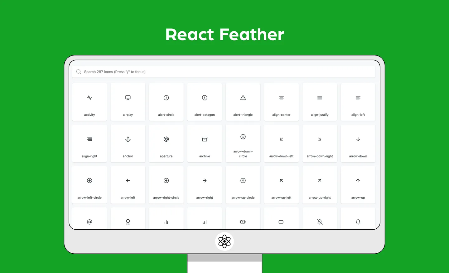
React Feather is a collection of minimalist open source icons for React, based on the Feather Icons library. This icon set emphasizes simplicity, consistency and readability.
Features
Installation
npm i react-featheror
yarn add react-featherExample usage
import React from 'react';
import { Camera } from 'react-feather';

const App = () => {
  return <Camera />
};

export default App;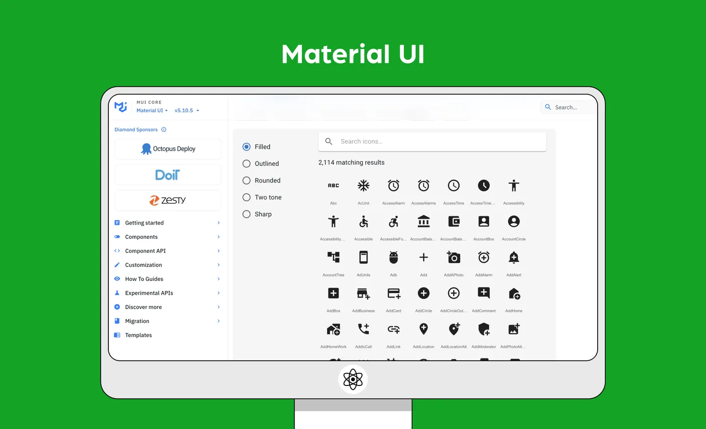
At over 81,000 stars on Github, this is one of the most popular UI tools. But what exactly is Material UI? Material UI (or MUI) isn’t just an icon library, but a suite of UI tools to help you design and ship projects fast.
It gives you access to the Material Icons library, which was created by Google in line with the Material Design system. Use them in five different styles: filled (default), outlined, rounded, two-tone, and sharp. With MUI, you can import these Material icons as SVG icons, or use its React wrapper to use custom font and SVG icons.
But thanks to its popularity, using Material UI means that your project could look similar to millions of other sites that also use this library.
Features
Installation
If you’re not using Material UI in your project then you can add it with:
npm install @material-ui/coreor
yarn add @material-ui/coreExample usage
import { AccessAlarm, ThreeDRotation } from '@material-ui/icons';

//or

import AccessAlarmIcon from '@material-ui/icons/AccessAlarm';
import ThreeDRotation from '@material-ui/icons/ThreeDRotation';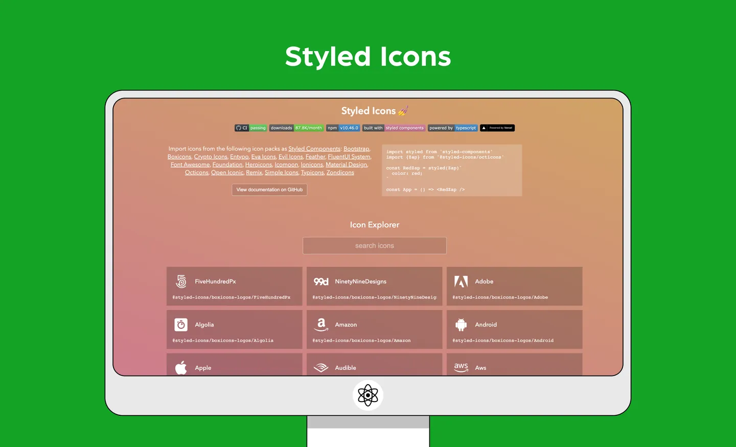
Styled Icons lets you import icons from popular libraries – such as Bootstrap, Feather, Font Awesome, Material Design, Remix and more – and use them as styled components. If you’re unfamiliar with what these are, styled components basically let you write CSS (Cascading Style Sheets) in your JavaScript.
Features
Installation
npm install styled-icons --saveor
yarn add styled-iconsExample usage
You can import individual icons:
import React, {Fragment} from 'react'
import {AccountCircle, Lock} from '@styled-icons/material'

const App = () => (
  <Fragment>
    <AccountCircle />
    <Lock />
  </Fragment>
)
Alternatively, you can install the icon packs you need. Check out the documentation for more information.
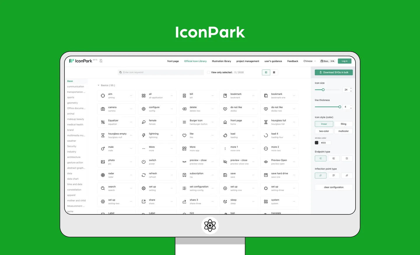
IconPark gives you access to 2,000 icons in four themes: outline, filled, two-tone or multi-colored. The interesting thing about this library is that it provides an interface for you to customize its icons – so you can see how different features, such as size, stroke width or line cap can affect how the icons look. You can download SVG files from this interface, or simply use it to preview icons as you include them in your React project.
Features
Installation
npm install @icon-park/react --saveExample usage
import {Home} from '@icon-park/react';

// examples
<Home/>
<Home theme="filled"/>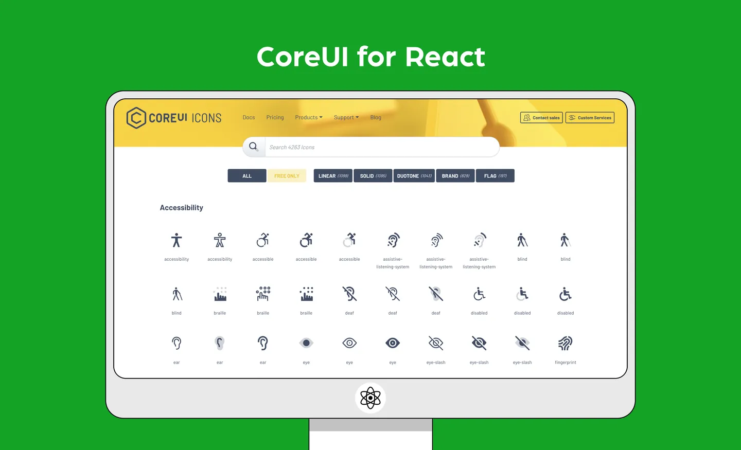
CoreUI is a component library for building admin dashboards. This means that you can use their ready-made components, instead of building them from scratch. It comes with an icon library, which offers 1,500 over free icons.
Features
Installation
// CoreUI Icons library
npm install @coreui/icons

// CIcon component
npm install @coreui/icons-react
or
yarn add @coreui/icons
yarn add @coreui/icons-react
Example usage
import { CIcon } from '@coreui/icons-react';
import { cilList, cilShieldAlt } from '@coreui/icons';

...
<CIcon icon={cilList} size="xl"/>
<CIcon icon={cilShieldAlt} size="xl"/>
...
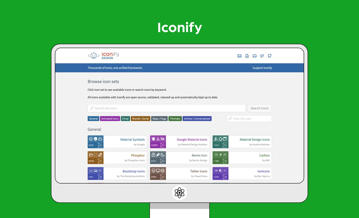
Iconify refers to itself as a “universal icon framework” as it gives you one syntax for a ton of different open source icon sets. Its icons are rendered as SVG, and can be customized.
Features
Installation
npm install --save-dev @iconify/react
or
yarn add --dev @iconify/reactExample usage
import { Icon } from '@iconify/react';
import home from '@iconify-icons/mdi-light/home';

function renderHomeIcon() {
	return <Icon icon={home} />;
}
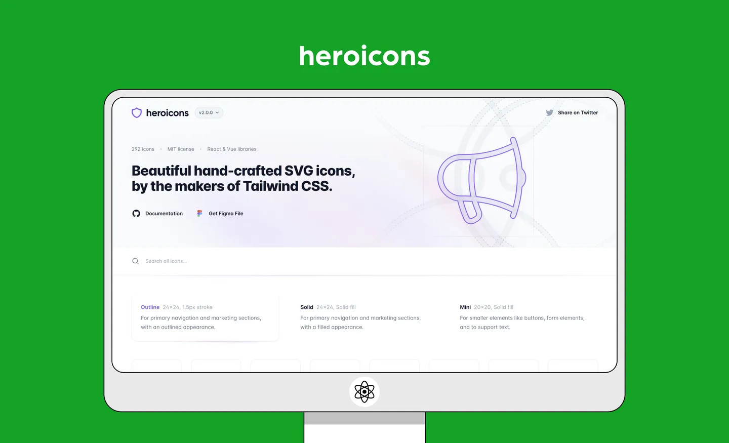
Heroicons is a well-known icon library. But even if you haven’t heard of this library, you’ve probably heard of its creators. Heroicons was created by the same makers of Tailwind, a popular CSS framework. This library offers a small – but beautiful – collection of 292 SVG icons.
Features
Installation
npm install @heroicons/reactExample usage
import { BeakerIcon } from '@heroicons/react/24/solid'

function MyComponent() {
  return (
    <div>
      <BeakerIcon className="h-6 w-6 text-blue-500"/>
      <p>...</p>
    </div>
  )
With this list of React icon libraries, we hope that designing and developing your next project gets a bit easier. If you’re looking for more development resources, check out our list of best Vue icon libraries.
Happen to be a designer instead? Check out IconScout’s entire collection of icons – including other design assets like Lottie animation, 3D illustrations and vector illustrations. Better yet, get them on your favorite design tools with IconScout’s plugins for Figma, Adobe Sketch and more.

